A cozy intimate feel
Blend traditional details and modern functionality
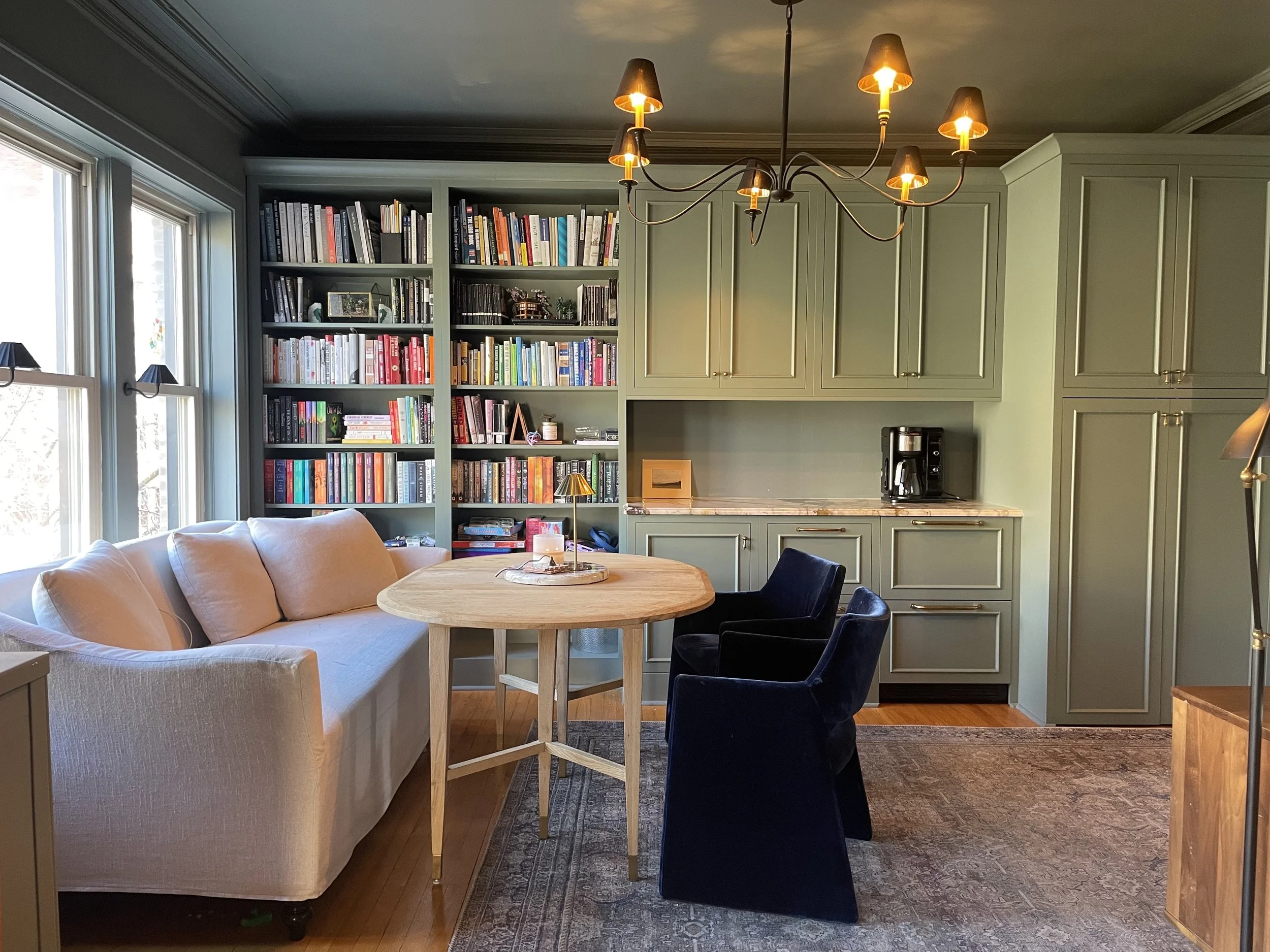
Colorful, but not loud


The Before
The Kitchen, Dining Room, and Bathroom are the primary focus of the scope for the renovation phase. The clients did not want to alter the footprint of the apartment and maintain as much of the existing millwork and period details as possible. We also limited alterations the current placement of major plumbing and electrical elements to focus budget on aesthetic and functional updates
-
The existing kitchen felt cramped and not functional for more than one person in the kitchen, which did not work well for this family that often prepared meals together. The washer dryer was intrusive in size and forced the oversized refrigerator into an awkward spot adjacent to the back door. The cleaning and cooking spaces significantly overlapped and did not allow for both activities to happen simultaneously. The expansive open countertop, while great in theory, was difficult to utilize dirty dishes were too distant from the sink space, preparing food forced the cook to constantly turn back and forth from the stove and put the cook in the way of access to all of the primary storage spaces.
Aesthetically, the clients did not love the feel of a white box. The cabinet design, hardware and materials didn’t feel like they fit with the 1930’s building which had retained a lot of original details throughout the rest of the living space. The goal was to inject color and personality while still feeling luxurious and warm.
-
The current dining room was severely underutilized square footage. The clients have young children and while they enjoy hosting, gatherings are casual not formal. The typical approach to a dining space would not align with how the family lives day to day and only result in a waste of highly valuable square footage in the this small vintage apartment.
-
The bathroom is the only one in the unit and for a family of 4, especially one with two young children, this bathroom needed to be able to function for a crowd. The vanity and tall cabinet in the corner on first glance look like valuable storage space, but in actuality did not hold nearly enough or allow for organization to justify their obtrusiveness. The materials were not only dated, but felt perpetually dirty & worn down. The clients wanted a brighter, cleaner space that felt suitable to the period of the building and just a little fancy.


The Plans


The Progress


Details of Note
-

Paneled Appliances
The use of paneled appliances eliminated the visual breaks in the cabinetry and significantly contributes to making the space feel larger and luxurious.
-

Slab Backsplashes
This galley kitchen was already a relatively small space and the introduction of another material started to feel busy. The slab backsplashes are easy continutiy on the eye, easier to clean, and allow double the opportunity to appreciate this beautiful green soapstone slabs.
-

Pocket Door Cabinet
The countertop cabinet opposite the fridge creates a mirror to the sink wall cabinet shape and adds valuable closed storage in a design without much closed storage. Custom pocket doors & interior shelving hides frequently used small appliances & the microwave.
-

Smart Storage Solutions
The strategic use of interior cabinet storage solutions maximize the interior storage of every cabinet that might typically feel too narrow for comfortable use. Meticulous cataloging creates a place for everything, and everything in its place
-

Custom Stone Apron
We loved the character an apron front sink adds to a design, but did not love the feel of traditional white farmhouse sinks, sleek stainless steel, or the practicality of stone or more modern materials. A custom cut stone apron front mimics the look and let us select the best undermount sink for its own features.
-

Brass Pot Rail
The clients collection of stainless steel pots and pans was difficult to fit into closed storage while avoiding including upper cabinets. A antiqued brass potrail allowed for easy access to each pan (without having to constantly unstack others) and added to the feel of a real cooks kitchen.
-

Walnut Open Shelves
The clients had already curated their everyday dishware to a simple, stackable collection. The open shelves allow them to easily access all of their dishes quickly whether plating snacks or dinner and their placement near the dishwasher makes for easy unloading, even if another is cooking.
-

Mosaic Floor Design
Because this kitchen had been updated over the years, it lacked any original details it might have had. Inspired by the mosaic entrance floors of buildings in the neighborhood, we custom designed this mosaic floor rug to feel like it could have always been there.